NL Startup Competition
A competition between startups in the Netherlands.
About
NL Startup Competition started as an initiative to create a ground for a competition between startups from all over Netherlands. The competition, divided in four categories, was aimed to drive attention to social impact: Energy Transition, Digital, Social and Circular/Sustainable.
My role in this project was to give the competition a clear and consistent visual identity that would connect with its audience. I worked on everything from the logo to event materials, focusing on a style that felt both innovative and approachable.
Follow along to see the design process I lead and how it all started!
My roles
Lead graphic designer (Print, digital, website)
Brand and logo development
Ideation and brainstorming
On-site support
The Process
For this competition, I was tasked with developing its entire visual identity, including its logo, digital assets and event materials along with brainstorming on what would be ideal to have in the event physically and activity-wise. The goal was to reflect the competition’s message while ensuring it appealed to startups and entrepreneurs.
Here is how I approached it:
1. Competitor Research
I began by researching similar competitions and events, analyzing how they communicated with their audiences. This involved studying their visual styles, language and how they connected with their audience.
2. Define
Based on my research, I defined the keywords that would guide the branding: innovation, ideation, connection, inclusivity and professionalism.
3. Design
With these keywords as foundation, I started brainstorming and sketching. In this stage, I experimented on which use of colors, shapes and typography would best communicate the message to the target audience.
4. Develop
Finally, I brought it all together to create the visual identity. This became the foundation across all materials I designed, from digital to print assets.
Branding
1. Logo
To design the logo for NL Startup Competition, I concentrated on reflecting the competition’s core values while maintaining simplicity and versatility: innovation, inclusivity, professionality… & Netherlands :) I emphasized connection and structure using geometric shapes, symbolic of the message the competition wanted to achieve.
I created the final design by reimagining the letters of the NL Startup Competition, together with modernity and professionalism and a clean look to emphasize the recognizability.

That’s not all! See here for the other logo proposals I made for the NL Startup Competition!
2. Visual Language
I chose following key fonts and colors to align with NL Startup Competition’s tone and target audience, ensuring visual consistency across all materials.


Website
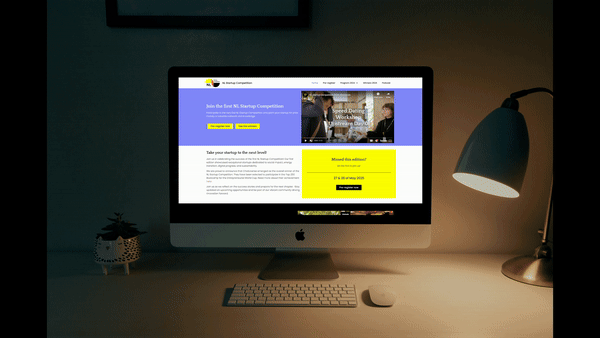
I designed and constructed the website as the competition's common ground, a place for participants to find information, register and stay updated. My aim was to make it as simple and user-friendly as possible.
Hence, I focused on clear navigation and content, along with a visually appealing layout. Using WordPress as the content management system and Elementor for its design, I built a site that was:
Straightforward: Key information was easy to find and CTA’s were clear.
Engaging: The visuals aligned with the competition’s identity.
Accessible: Registration and updates were simple to manage.
Social Media
Social media was key to reaching startups and building excitement for the competition. I designed templates that were easy to customize while maintaining a consistent visual identity.
I focused on clean layouts and vibrant visuals that made information easy to digest. These templates allowed the team and partners to post updates, announcements which resulted in driving engagement and reinforcing the identity of NLSC.


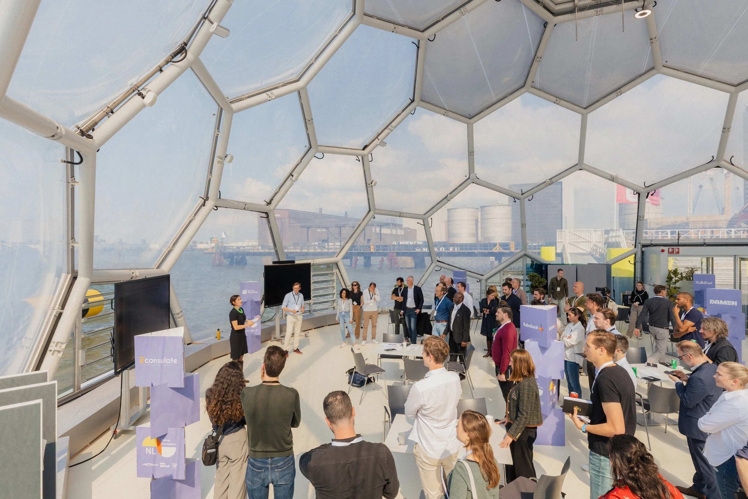
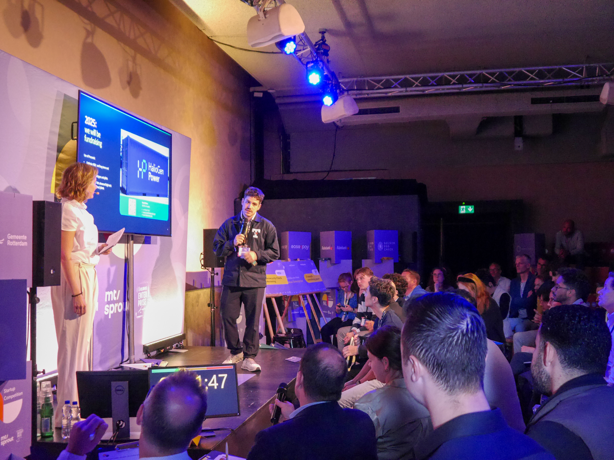
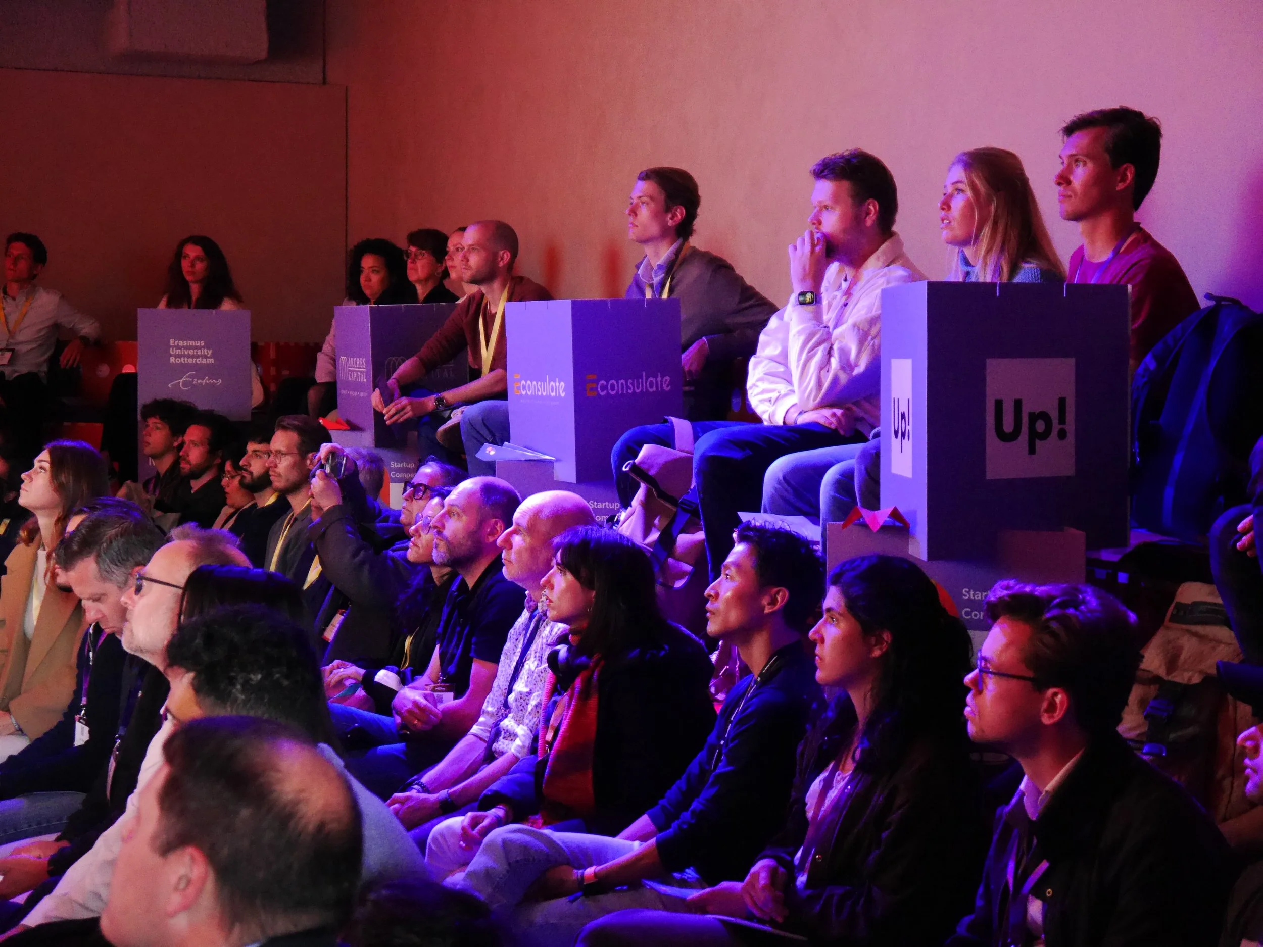
Event Materials
For the physical event, my focus was on creating materials that enhanced the attendee experience. On every material, from badges to cheques, I brainstormed and designed them to be practical and visually cohesive while leaving a lasting impression on the participants and visitors.


Competition Time!
#
Competition Time! #
Here’s a look at the first and second editions of the NL Startup Competition! See how the branding of the assets brought this competition’s visual identity to life.