Logo-folio
A collection of logos I have designed.
Concept to Design
Over the past two years, I’ve been responsible for creating logos for various projects, competitions and events. Each came with its own requirements, target audience and goals. My role in these projects was to develop visual identities that worked for their purpose.
For every project, I began with research: understanding the audience, analyzing competitors and identifying the key themes that needed to come through. From there, I developed three different logo concepts, each highlighting a different side of the project’s identity. One was then selected, refined and applied to digital and physical assets.
Following, you will see some projects and all the logo proposals for each of them.
AI Pitch Competition
Project
Internal - Braventure, Erasmus Enterprise
Year
2024
The AI Pitch Competition connects AI startups in Brabant, giving them a platform to pitch their ideas. For this competition, my task was to create a visual identity that felt modern, tech-driven and professional and resonated with AI startups.
I developed three logo concepts, each focusing on a different aspect of AI. The final logo then was refined to ensure it worked on both online and offline materials.
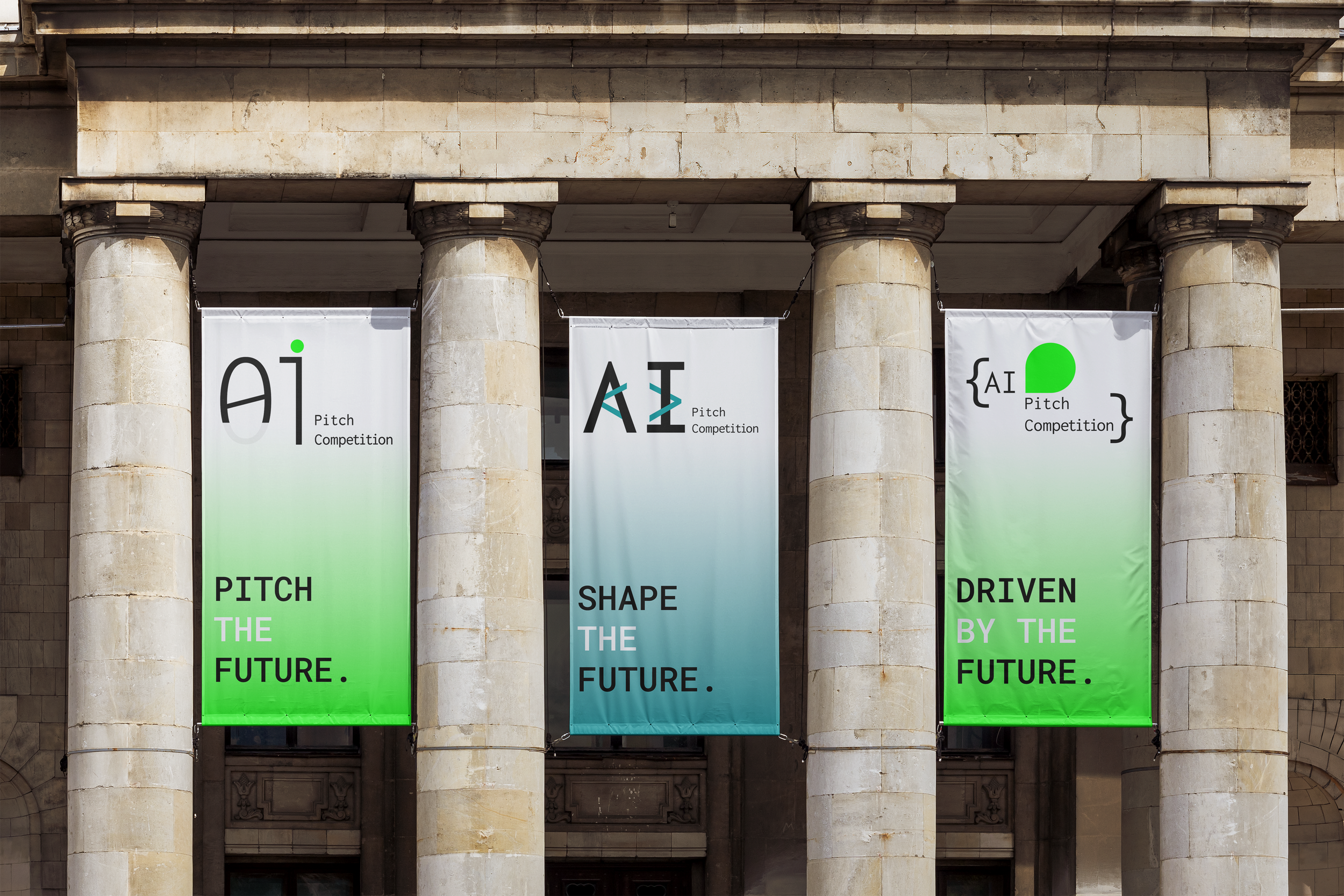
-

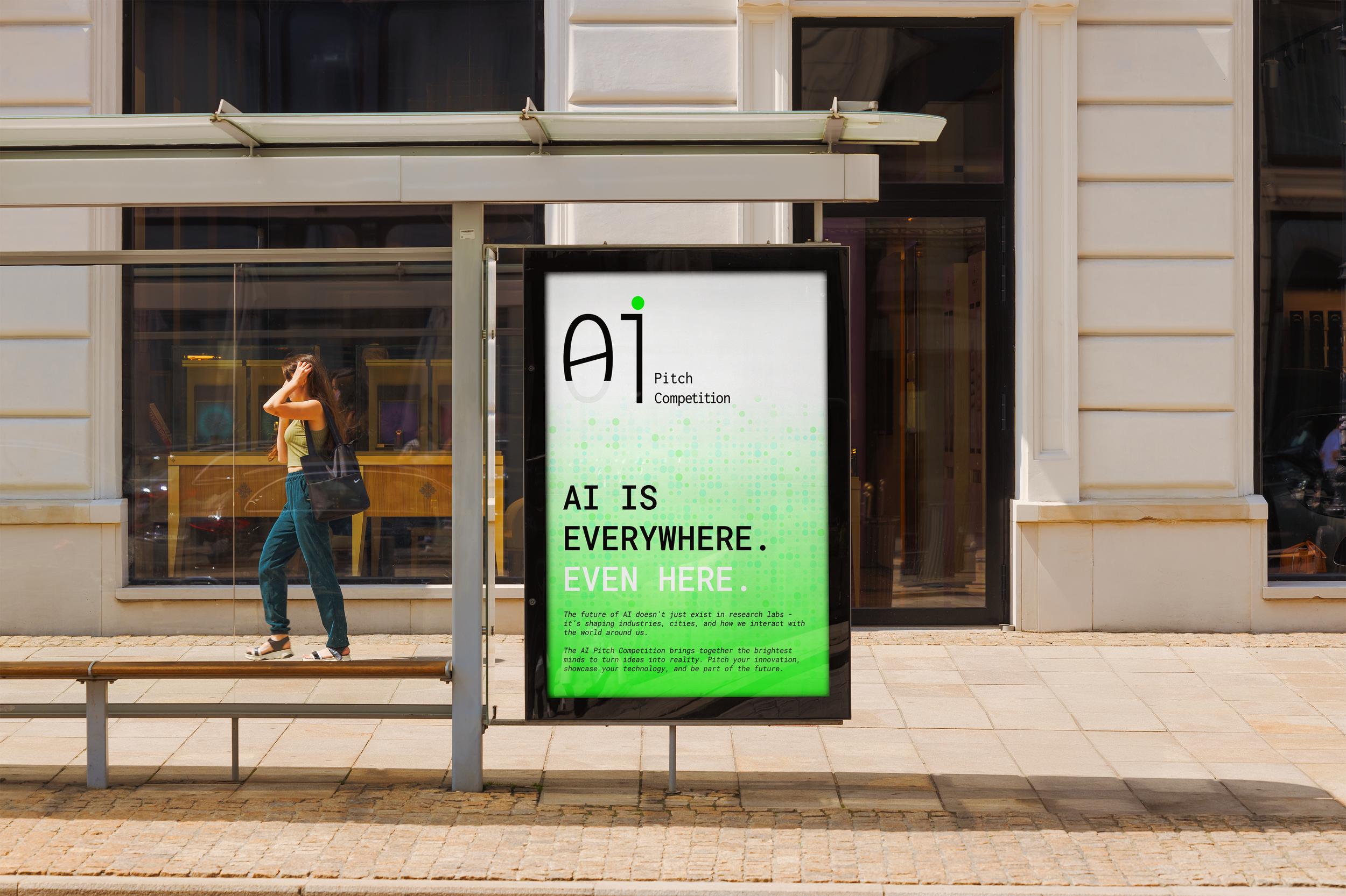
I
The logo is inspired from the binary system (01), reflecting the fundamental coding and building of AI with the aim to resonate with technological aspects of AI. The number 01 is cut into to make up the letters AI.
-

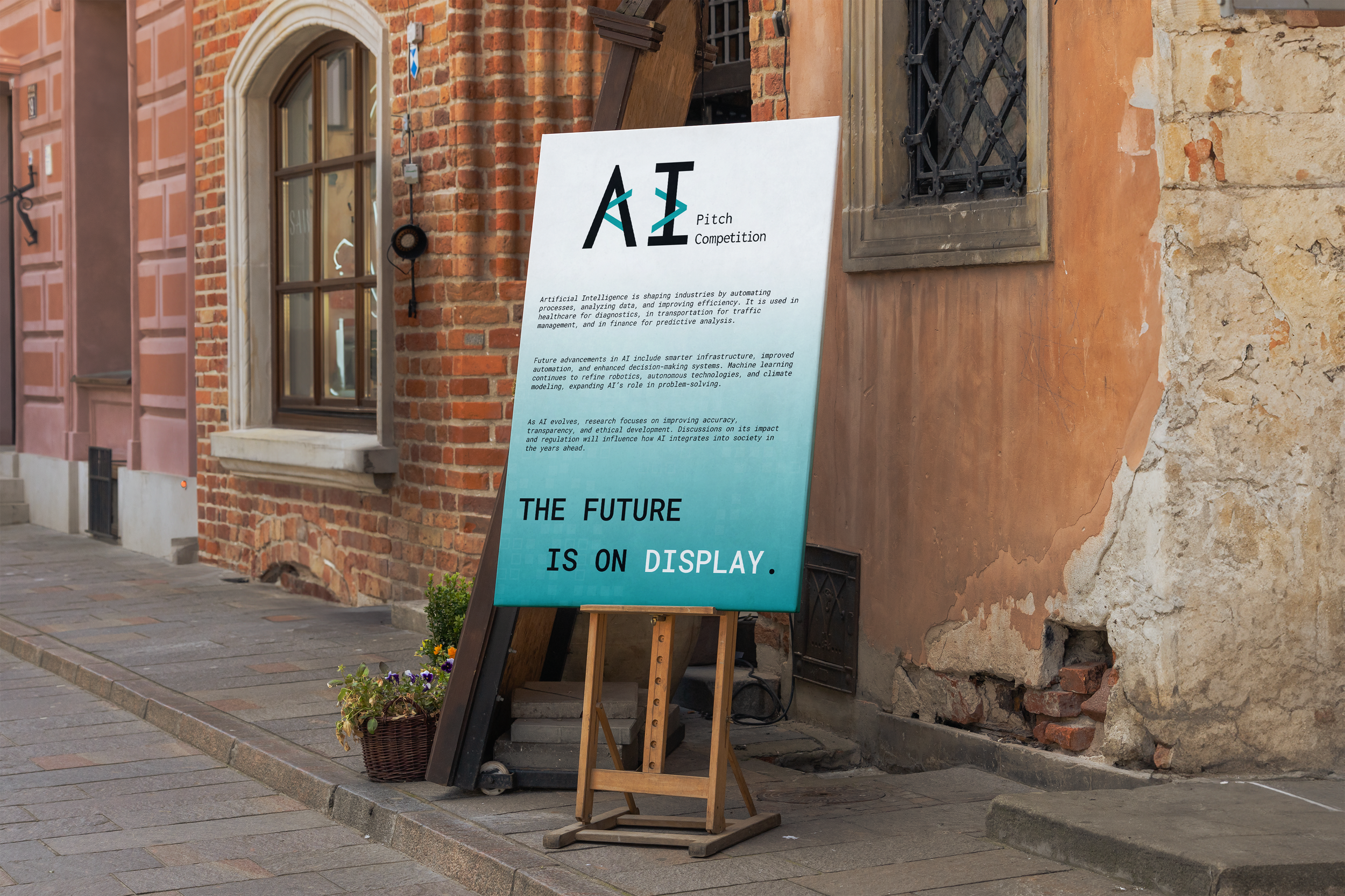
II
The logo is inspired from {the brackets} used in coding and the shape used reflects the pitching aspect and a chat bubble used to communicate with AI models while reflecting the tech focus of the competition.
-

III
This logo integrates the angle brackets, a referral to developmental side of AI, as much as innovation and technology.
NL Startup Competition
Project
Internal - Erasmus Enterprise
Year
2024
NL Startup Competition is an initiative that aims to bring together startups across certain categories to showcase their ideas, pitch to a live audience, and connect with key players in the entrepreneurial ecosystem.
For this program, I was tasked with creating a visual identity that reflected the nature of the startup ecosystem and a competition. While keeping the focus on entrepreneurship, I used orange as a subtle reference to it being in the Netherlands.
Here are the logo proposals I developed.
-

I
The logo contains two shapes (two lines from the letter N) and geometric shapes (that are the edges of the letters L from NL) represent the individuality and competition aspect and the rising to the top by winning effect thanks to the uneven placement of the shapes.
-
II
A variation of the final logo, this version applies a gradient colors, representing the competition’s organizational partners’ brand colors. The fluid color transition reinforces collaboration, innovation and the dynamic nature of startups, making the design more vibrant and adaptable.
-

III
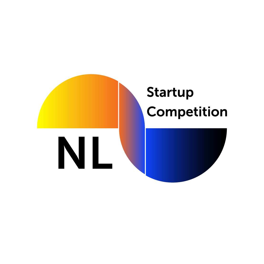
The logo contains half-circle and quarter-circle elements that subtly form the letters "N" and "L." This design emphasizes connection, transition and inclusion, reflecting the way startups evolve and scale. The gradual change in geometric forms represents growth, adaptability, and the interconnectivity of entrepreneurship.


Talent for Transition
Project
Internal - Erasmus Enterprise
Year
2023
Talent for Transition is a program initiated by Erasmus Enterprise to empower young professionals and students to drive sustainable innovation. Through workshops and more activities within this program, it is designed to help participants explore how they can contribute to long-term social and environmental transitions.
I was asked to design a visual identity that would reflect the program’s nature. Hence, I created three logo concepts, each reflecting a different side of the program. Below is a summary of my logic behind each one.
-

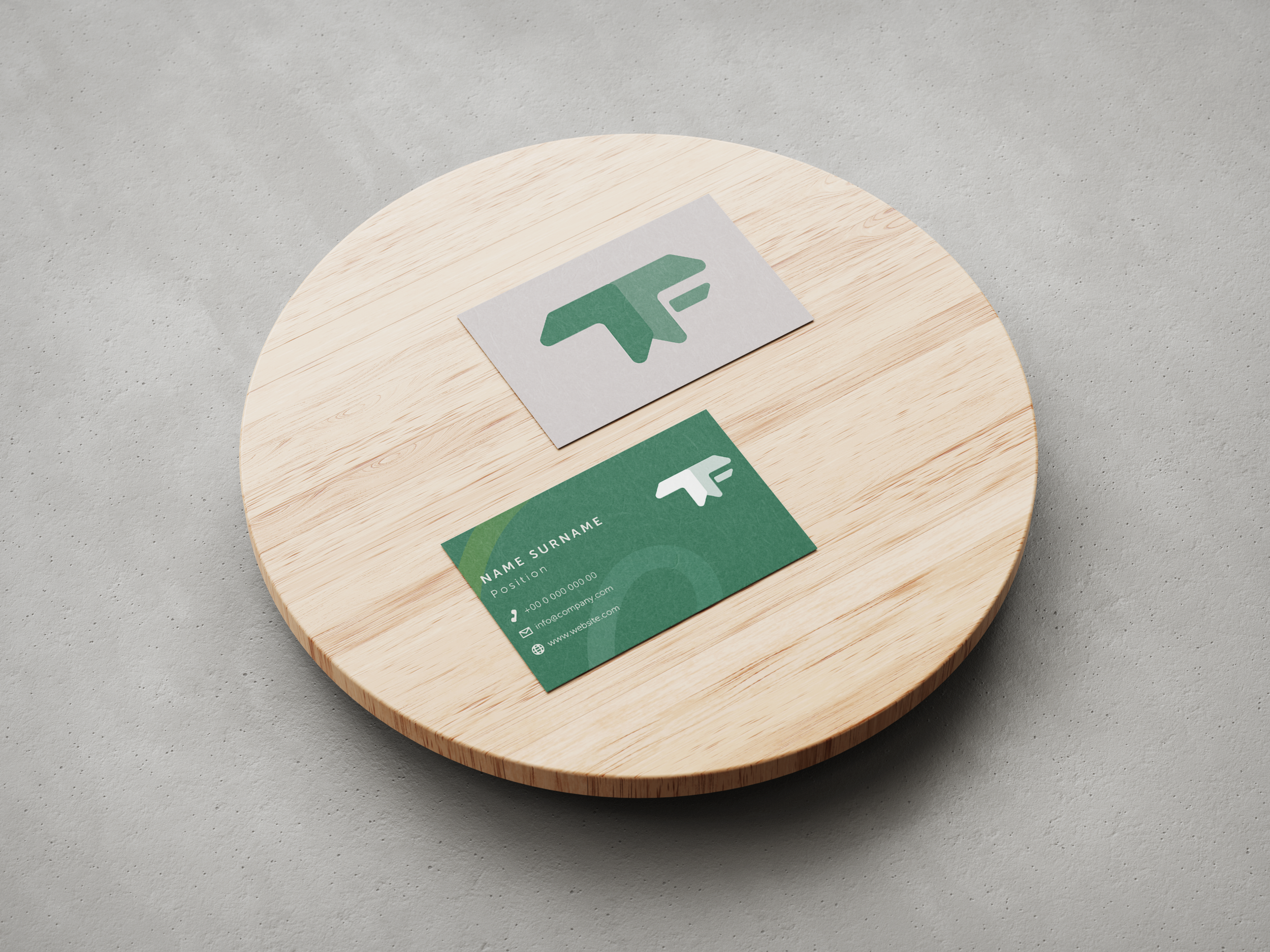
I - Social
The logo contains two shapes with arc (two T’s from Talent for Transition (TFT)) to recall people element in the icon and to represent connection and transition thanks to the gradual change in the two lines in between (F from TFT) and the logo itself.
-

II - Connection
The logo contains two shapes (two T’s from TFT) that has a resemblance with conversation bubbles to represent the networking and connection opportunity that comes with the Talent for Transition events and the versatility in the topics presented by the Talent for Transition.
-

III - Progress
The logo has been created from “arrows” to indicate movement and progress. It consists of two arrows to represent two T’s and an additional horizontal element to represents F. The use of green highlights the forward-thinking and reliability of Talent for Transition.